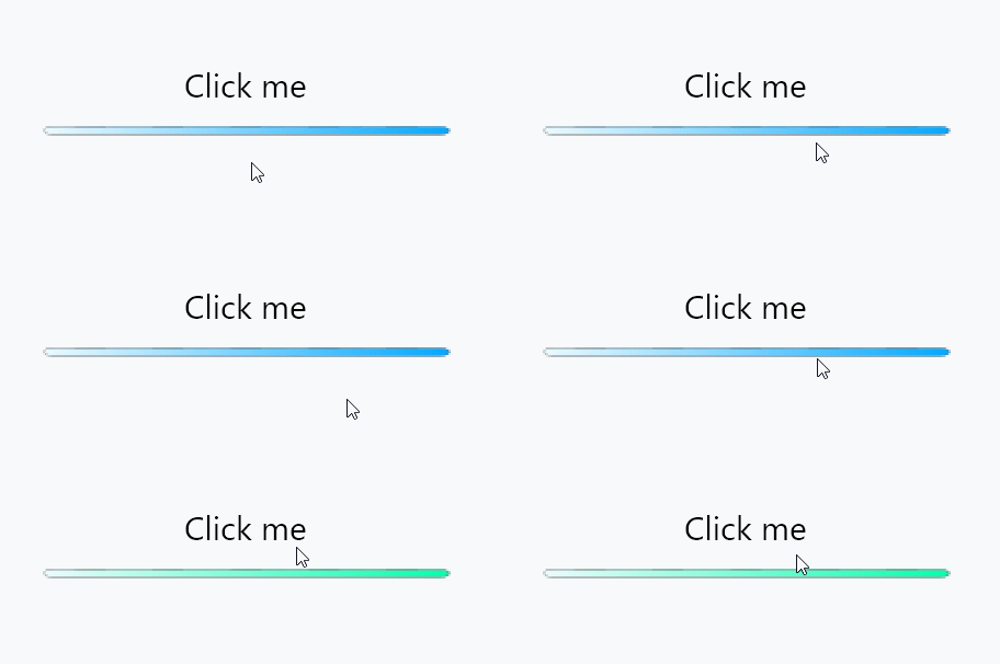
On this article, I will describe how to create a button whose background is filled by images on a crossplatform GUI library, Avalonia UI.

I had a harder time to make it than I had expected. I beleive that this saves your time.
Precondition Link to heading
- You have an Avalonia project already.
- You have finished to choose images to use already.
I recommend you to prepare three images, normal, hovering, clicking.
Indeed, you can do it with just one image.
1. Put images into Assets folder Link to heading
First, put all images into Assets folder, which should be generated by Avalonia. It’s because we can touch them easier on the code.
If the Assets folder doesn’t exist, you should create one and append a XML content to your project file:
<ItemGroup>
  <AvaloniaResource Include="Assets\*"/>
</ItemGroup>
2. Create a UserControl Link to heading
Here is a quote from the tutorial of Avalonia.
You can change the name of it whatever you want.
[Visual Studio]
- Right click your project’s Views folder in Solution Explorer
- Select the Add -> New Item menu item
- In the dialog that appears, navigate to the “Avalonia” section in the category tree
- Select “User Control (Avalonia)”
- Enter TodoListView as the “Name”
- Click the “Add” button
[.NET Core]
dotnet new avalonia.usercontrol -o Views -n TodoListView --namespace Todo.Views
After that, you will get a XAML file, whose contents should be like that:
<UserControl xmlns="https://github.com/avaloniaui"
    	xmlns:x="http://schemas.microsoft.com/winfx/2006/xaml"
    	xmlns:d="http://schemas.microsoft.com/expression/blend/2008"
    	xmlns:mc="http://schemas.openxmlformats.org/markup-compatibility/2006"
    	mc:Ignorable="d" d:DesignWidth="800" d:DesignHeight="450"
    	x:Class="Hoge.Views.ImageButton">
    <StackPanel>
        Hello World
    </StackPanel>
</UserControl>
It’s just a UserControl so it is never shown without editing kinds of MainWindow. If you don’t know how to let it shown, you can google it.
Replacing the text, “Hello World” with your specific UI, it would be shown.
Create a button Link to heading
I think you can easily understand this section if you have any experiences in writing HTML+CSS. They looks like each other. I can describe about the things for long time, but it makes nothing. Seeing is believing.
<UserControl xmlns="https://github.com/avaloniaui"
    	xmlns:x="http://schemas.microsoft.com/winfx/2006/xaml"
    	xmlns:d="http://schemas.microsoft.com/expression/blend/2008"
    	xmlns:mc="http://schemas.openxmlformats.org/markup-compatibility/2006"
    	mc:Ignorable="d" d:DesignWidth="800" d:DesignHeight="450"
    	x:Class="AvaloniaTest.Views.MainContents">
    <StackPanel>
        <StackPanel.Styles>
            <Style Selector="Button.ImageButton">
                <!-- Write styles here -->
            </Style>
        </StackPanel.Styles>
        <Button Classes="ImageButton">Click me</Button>
    </StackPanel>
</UserControl>
This is a code, which shows a normal button. We will customize and shape it to what we want.
Use images as a background of the button Link to heading
To achieve to create a button we expected, we use ImageBrush, which can draw a image, to the background of the button.
<UserControl xmlns="https://github.com/avaloniaui"
    	xmlns:x="http://schemas.microsoft.com/winfx/2006/xaml"
    	xmlns:d="http://schemas.microsoft.com/expression/blend/2008"
    	xmlns:mc="http://schemas.openxmlformats.org/markup-compatibility/2006"
    	mc:Ignorable="d" d:DesignWidth="800" d:DesignHeight="450"
    	x:Class="AvaloniaTest.Views.MainContents">
    <StackPanel>
        <StackPanel.Styles>
            <Style Selector="Button.ImageButton">
                <!-- Please change it as you like -->
                <Setter Property="FontSize" Value="30" />
                <Setter Property="Width" Value="400" />
                <Setter Property="Height" Value="100" />

                <!-- Set a background -->
                <Setter Property="Background">
					<Setter.Value>
                        <!-- avares://[Project name]/Assets/[File name] -->
						<ImageBrush Source="avares://AvaloniaTest/Assets/ButtonBar.png" />
					</Setter.Value>
				</Setter>
            </Style>
        </StackPanel.Styles>
        <Button Classes="ImageButton">Click me</Button>
    </StackPanel>
</UserControl>

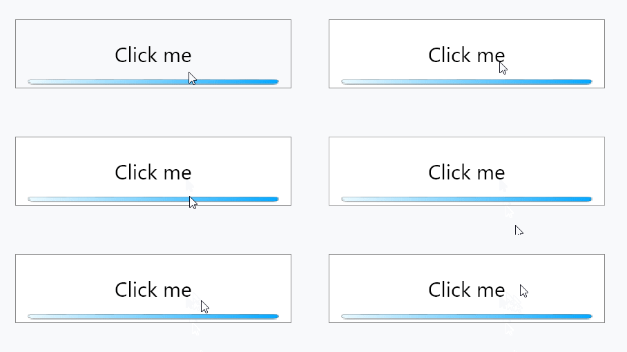
There is a border which is not needed. Setting the value BorderThickness as zero have it deleted.
<Setter Property="BorderThickness" Value="0" />
Style changes while user pointer hovering Link to heading
<!-- On user pointer hovering -->
<Style Selector="Button.ImageButton:pointerover">
	<Setter Property="Background">
		<Setter.Value>
            <!-- avares://[Project name]/Assets/[File name] -->
			<ImageBrush Source="avares://AvaloniaTest/Assets/ButtonBar_Hover.png" />
		</Setter.Value>
	</Setter>
</Style>
Like CSS, you can implement the style changes corresponding user actions by selector, which formatted as [Class name]:[Action].
Note that it is pointerover, not hover.
After it applies, the button would be:

Style changes while user clicking Link to heading
This is the most important point of this article.
You may think it just write Button.ImageButton:pressed and work well. I did think too, but things don’t work that well in the real world…
<!-- On user clicking -->
<Style Selector="Button.ImageButton:pressed /template/ ContentPresenter">
    <Setter Property="Background">
        <Setter.Value>
            <!-- avares://[Project name]/Assets/[File name] -->
            <ImageBrush Source="avares://AvaloniaTest/Assets/ButtonBar_Click.png" />
        </Setter.Value>
    </Setter>
</Style>
Write Button.ImageButton:pressed /template/ ContentPresenter or it would NOT work well. All we have to do is to remember this. It’s not difficult, isn’t it?
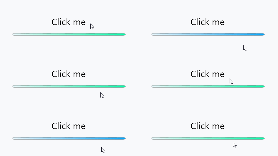
After all, we make it.

If you know better ways, please let me know.
Full code Link to heading
<UserControl xmlns="https://github.com/avaloniaui"
    	xmlns:x="http://schemas.microsoft.com/winfx/2006/xaml"
    	xmlns:d="http://schemas.microsoft.com/expression/blend/2008"
    	xmlns:mc="http://schemas.openxmlformats.org/markup-compatibility/2006"
    	mc:Ignorable="d" d:DesignWidth="800" d:DesignHeight="450"
    	x:Class="AvaloniaTest.Views.MainContents">
    <StackPanel>
        <StackPanel.Styles>
            <Style Selector="Button.ImageButton">
                <!-- Please change it as you like -->
                <Setter Property="FontSize" Value="30" />
                <Setter Property="Width" Value="400" />
                <Setter Property="Height" Value="100" />
                <Setter Property="BorderThickness" Value="0" />

                <!-- Set a background -->
                <Setter Property="Background">
					<Setter.Value>
                        <!-- avares://[Project name]/Assets/[File name] -->
						<ImageBrush Source="avares://AvaloniaTest/Assets/ButtonBar.png" />
					</Setter.Value>
				</Setter>
            </Style>
            <!-- On user pointer hovering -->
            <Style Selector="Button.ImageButton:pointerover">
                <!-- Set a background -->
                <Setter Property="Background">
                    <Setter.Value>
                        <!-- avares://[Project name]/Assets/[File name] -->
                        <ImageBrush Source="avares://AvaloniaTest/Assets/ButtonBar_Hover.png" />
                    </Setter.Value>
                </Setter>
            </Style>
            <!-- On user clicking -->
            <Style Selector="Button.ImageButton:pressed /template/ ContentPresenter">
                <!-- Set a background -->
                <Setter Property="Background">
                    <Setter.Value>
                        <!-- avares://[Project name]/Assets/[File name] -->
                        <ImageBrush Source="avares://AvaloniaTest/Assets/ButtonBar_Click.png" />
                    </Setter.Value>
                </Setter>
            </Style>
        </StackPanel.Styles>
        <Button Classes="ImageButton">Click me</Button>
    </StackPanel>
</UserControl>